
Project Overview
Prototype Link
The Problem:
Grocery shopping in physical stores can be painful: it is often inefficient, time consuming, and unenjoyable, no matter what chain customers shop at. Some stores, such as HEB and Whole Foods, have attempted to address these grievance points by creating apps that aim to improve customers’ shopping experiences; however, they are not very comprehensive. This includes Trader Joe’s, which fails to have any mobile application to address these issue.
The Solution:
My two partners and I decided to create a ground-up app that outstrips its competitors’ apps and takes the small chain to a more competitive playing field with larger companies. Its main focus will be addressing is how inefficient grocery shopping can be. Inefficiency results when customers forget their shopping list, forget items other household members need, or cannot locate items.
Note: This was not in affiliation with Trader Joe’s and was conducted as a semester-long assignment for the Fall 2017 Human-Computer Interaction class at the University of Texas School of Information.
My Role:
research, design, IA, user app flow, wireframes, prototyping, usability testing
Tools:
Sketch, Invision
Contextual Inquiry and Analysis
Raw Data Collection and WAAD Diagram
To gather the necessary data, we first collected information on pain points from both the client and consumer sides before synthesizing them into work activity notes (WAN) and categorizing them into a work activity affinity diagram (WAAD).
Steps: Collect data > synthesize data > create WAN notes > create WAAD diagram
Collecting data
We conducted three types of information-gathering interviews to collect our raw data: a client interview, five user (in this case, consumer) interviews, and an online survey. Due to time constraints, the majority of our information came from an online survey. Overall, we gathered information from 133 unique individuals.
Synthesizing Data
We looked for general patterns and trends in the online survey and synthesized them into WANs. For the client and user interviews, we would take direct or paraphrased quotes and create WANs as well. We tried to pay more attention to the direct interviews since they provided richer data.

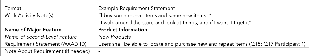
Example of raw data synthesized into a WAN note
WAAD Diagram
The diagram we created had two difference iterations, as we felt the first was insufficient and the WANs could be better categorized.

WAAD, 2nd version
Other Inquiry Methods
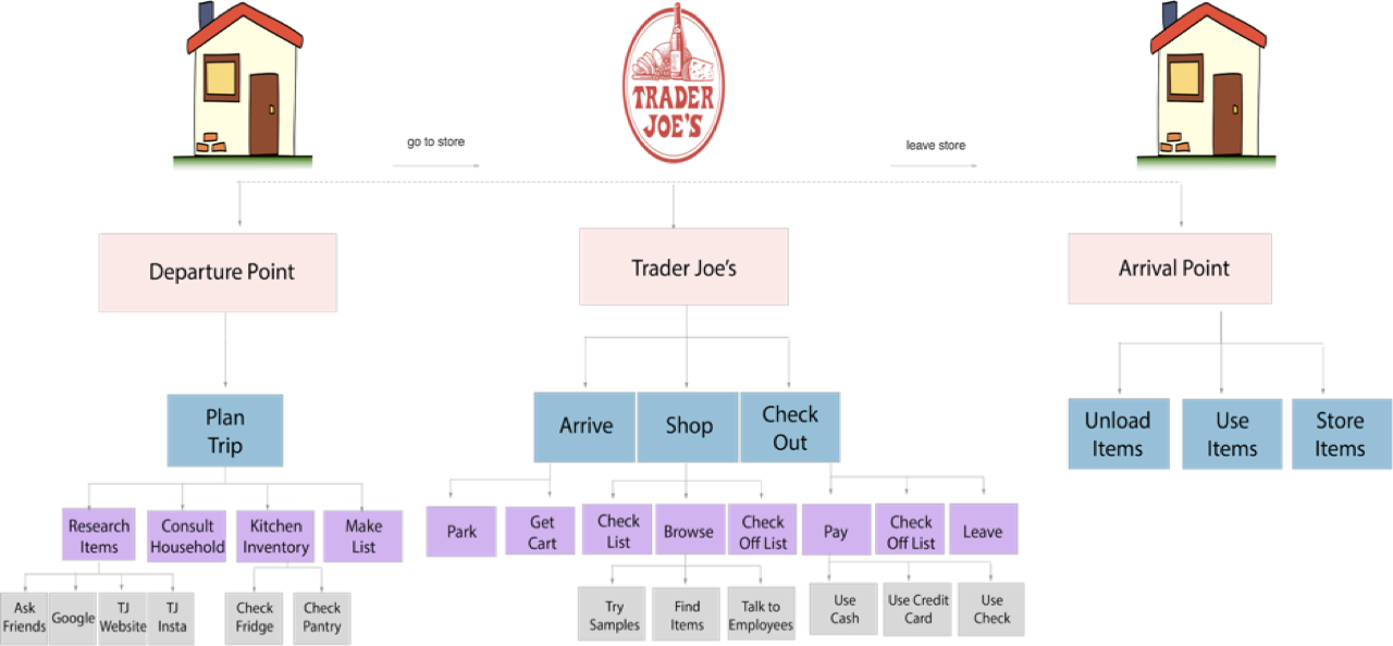
Aside from creating the WAAD, we also discussed work roles, including main, sub-, and machine roles. Finally, we white-boarded a flow model diagram during a meeting.

Flow model diagram
Requirements and Modeling
Requirements
We moved forward into identifying design requirements by walking through the WAAD. We then modeled the needs of our user base with an emphasis towards the consumer side of grocery shopping experience rather than the producer side because our overall design is focused on the consumer grocery shopping experience rather than the producer side.
WAAD Requirements
Modeling
We created the following models:
1. User Models
a. Consumer User Model
b. Producer User Model
2. Usage Model
a. Flow Model
3. Task Structure Model
a. Hierarchical Task Inventory
4. Task Interaction Models
a. Usage Scenarios (3)
b. Step-By-Step Task Interaction Models (2)
c. Essential Use Case Task Interaction Models (2)
Hierarchical Task Inventory

User Scenario
Design
Upon entering the design phase, we created three personas (one each) before synthesizing them into a single main persona that represented the main pain points.

After creating the persona, we moved to ideation. We created mental models, conceptual designs, and storyboards. We decided to focus on building out four main sections of the app that we could test users with. Ultimately, we created 21 paper wireframes that we then translated into low fidelity wireframes on Sketch.

Preliminary sitemap highlighting the four categories that will contain user tasks
User Testing
We created four main tasks (some with subtasks), one per category. We tested the inVision prototype created with our screens on one user. The prototype also underwent a heuristic evaluation by another group in the class, where they identified high, medium, and low severity issues with the prototype.
Redesign
Using this feedback, we redesigned some of the features. One of the redesigns is as follows.

Original (left/center): After an item is added, the user is redirected to their list page.
Redesign (right): The user stays on the product page and is notified that the item had been added to their cart.
Future Directions
This project is by no means finished. There are many tasks that need to be completed, such as:
building out rest of app
conducting extensive usability testing
finishing other redesigns